


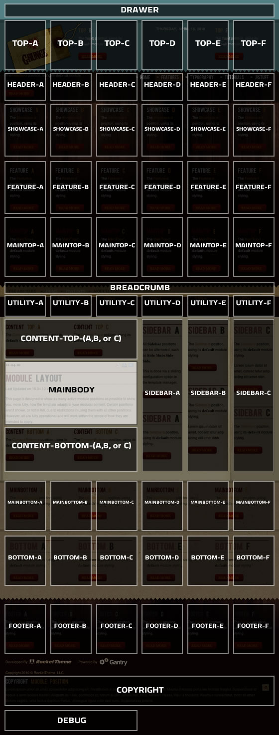
This page is designed to show as many active module positions as possible to show you, more fully, how the template adapts to your modular content. Certain positions aren't shown, or not in full, due to restrictions in using them with all other positions. However, all are fully operational and will work within the scope of how they are intended to apply.
There are 68 collapsible module positions. If no module is published to a position, it will not appear, collapsing the entire area.
There are non-standard elements that are injected into the template grid structure when enabled via the template parameter.
For example: The logo element is injected into the top-a position. It is inserted in a stacked fashion, meaning, if there are modules published to the top-a position, they will appear in the same column as the logo, just one place below.
You can change the positions of these elements at Extensions → Template Manager → rt_grunge_j15
The below diagram is of the Module Layout page.
This tutorial page features all the typography available with the template. If you would like to read more detailed information on inserting the included typography into your content, check out the Typography Tutorial.
Praesent rutrum sapien ac felis. Phasellus elementum dolor quis turpis. Vestibulum nec mi vitae pede tincidunt nonummy. Vestibulum facilisis mollis neque. Sed orci. Cum sociis natoque penatibus et magnis dis parturient montes, nascetur ridiculus mus. Sed euismod magna a nibh.
Proin ac nunc eu nunc condimentum accumsan. Phasellus odio justo, euismod vitae, egestas a, porttitor in, urna. Maecenas vitae mauris. Donec vestibulum, nunc eu varius pharetra, massa est sagittis odio, sit amet eleifend elit dolor id tortor.
Lorem ipsum dolor sit amet, consectetuer adipiscing elit. Proin sit amet odio quis sapien molestie ultrices. Vivamus quis lectus. Praesent eu mi. Curabitur pharetra leo sed nisl. Nunc vel nisi. Aliquam nulla. Etiam at est. Pellentesque arcu diam, tempus nec, sodales eu, ullamcorper quis, risus.
Proin ac nunc eu nunc condimentum accumsan. Phasellus odio justo, euismod vitae, egestas a, porttitor in, urna. Maecenas vitae mauris. Donec vestibulum, nunc eu varius pharetra, massa est sagittis odio, sit amet eleifend elit dolor id tortor.
Mauris euismod. In ac massa vitae quam tincidunt dapibus. Ut at tortor nec mi mattis blandit. Maecenas venenatis lorem at nulla. Phasellus a libero. Sed odio odio, eleifend dignissim, feugiat vel, tempor nec, ligula. Suspendisse lacinia convallis nulla.
Vestibulum posuere, lacus aliquet pulvinar faucibus, tortor urna luctus diam, vitae ultrices ante magna non tellus. Donec nunc magna, posuere eget, aliquam in, vulputate in, lacus. Sed venenatis. Donec nec dolor vitae mauris dapibus ullamcorper. Etiam iaculis mollis tortor.
Pellentesque vel enim urna, sit amet blandit ipsum. Maecenas quis sem sit amet nunc pretium mattis. Sed dapibus semper est, sed pretium erat sodales sed. Aenean hendrerit fringilla sem, et tincidunt libero ornare at. Sed venenatis pretium mauris sed vehicula.
This is a blockquote, you will want to use the following formatting: <blockquote><p>....</p></blockquote>. Praesent rutrum sapien ac felis. Phasellus elementum dolor quis turpis. Vestibulum nec mi vitae pede tincidunt nonummy. Vestibulum facilisis mollis neque. Sed orci. Cum sociis natoque penatibus et magnis dis parturient montes, nascetur ridiculus mus. Sed euismod magna a nibh.
PPraesent rutrum sapien ac felis. Phasellus elementum dolor quis turpis. Vestibulum nec mi vitae pede tincidunt nonummy. Vestibulum facilisis mollis neque. Sed orci. Cum sociis natoque penatibus et magnis dis parturient montes, nascetur ridiculus mus. Sed euismod magna a nibh.
You will need to use the following formatting: <p class="dropcap"><span class="dropcap">P</span></p>
Number Examples
1You will need to use the following formatting: <p class="dropcap"><span class="dropcap">1</span></p>
2You will need to use the following formatting: <p class="dropcap"><span class="dropcap">2</span></p>
3You will need to use the following formatting: <p class="dropcap"><span class="dropcap">3</span></p>
Praesent rutrum sapien ac felis. Phasellus elementum dolor quis turpis. Vestibulum nec mi vitae pede tincidunt nonummy. Vestibulum facilisis mollis neque. Sed orci. Cum sociis natoque penatibus et magnis dis parturient montes, nascetur ridiculus mus.Inset Right TitleYou will need to use the following formatting: <span class="inset-right"><span class="inset-right-title">....</span> ... some content ... </strong>Vestibulum facilisis mollis neque. Sed orci. Cum sociis natoque penatibus et magnis dis parturient montes, nascetur ridiculus mus. Sed euismod magna a nibh.
Praesent rutrum sapien ac felis. Phasellus elementum dolor quis turpis. Vestibulum nec mi vitae pede tincidunt nonummy. Vestibulum facilisis mollis neque. Sed orci. Cum sociis natoque penatibus et magnis dis parturient montes, nascetur ridiculus mus.Inset Left TitleYou will need to use the following formatting: <span class="inset-left"><span class="inset-left-title">....</span> ... some content ... </span>Vestibulum facilisis mollis neque. Sed orci. Cum sociis natoque penatibus et magnis dis parturient montes, nascetur ridiculus mus. Sed euismod magna a nibh.
Sed euismod magna a nibh. Praesent rutrum sapien ac felis. Phasellus elementum dolor quis turpis. Vestibulum nec mi vitae pede tincidunt nonummy. Praesent rutrum sapien ac felis. Phasellus elementum dolor quis turpis. Vestibulum nec mi vitae pede tincidunt nonummy. Vestibulum facilisis mollis neque. Sed orci. Cum sociis natoque penatibus et magnis dis parturient montes, nascetur ridiculus mus.Praesent rutrum sapien ac felis. Phasellus elementum dolor quis turpis. Vestibulum nec mi vitae pede tincidunt nonummy. Vestibulum facilisis mollis neque. Sed orci. Cum sociis natoque penatibus et magnis dis parturient montes, nascetur ridiculus mus.
This is a sample <pre>...</pre> tag:

div.modulebox-black div.bx1 {
  background: url(../images/black/box_bl.png) 0 100% no-repeat;
}

div.modulebox-black div.bx2 {
  background: url(../images/black/box_tr.png) 100% 0 no-repeat;
}

div.modulebox-black div.bx3 {
  background: url(../images/black/box_tl.png) 0 0 no-repeat;
  padding: 0;
  margin: 0;
}
Over rozen valt veel te vertellen. Hoe en wanneer u ze het best kunt planten, behandelen, bemesten, snoeien etc. Geregeld geven wij op Stadskwekerij Zaltbommel demonstraties en workshops!

Heeft u een vraag? Het antwoord vindt u op deze pagina.
